
In an increasingly component-driven development world, a well-organized, efficient approach to managing these independent parts is key.
Bit provides a powerful, open-source solution for creating, sharing, and managing these components. Here, we'll explore how to leverage Bit's capabilities in a Next.js project, fostering better component isolation and modularity.
- See the demo NextJS project with the Bit components
- See the live demo app
- See the Bit scope for the demo components
In this project we assume you already have a running NextJS application. If not, run the following:
npx create-next-app@latest
Initialize Bit at the root of your NextJS project by running the following command:
bit init
You will be prompted with several questions, we recommend the following answers:
- Which environment would you like to use? None.
- Would you like to use your own package manager instead of Bit? Yes.
- Would you like to use the MCP server for AI-powered development: Yes (and select your IDE).
After all is completed, install your dependencies to have Bit fully initialized:
pnpm install
- Set
defaultScopeper your Bit Cloud account:
// workspace.jsonc "defaultScope": "learnbit-react.rocket-roster",
- Install the Bit-NextJS plugin
npm i @frontend/nextjs.nextjs-env --save-dev
- Configure the NextJS Bit Plugin in
workspace.jsonc
// workspace.jsonc "teambit.generator/generator": { "envs": [ "frontend.nextjs/nextjs-env" ] }
Watch for changes in the node_modules directory
Bit generates a corresponding Node package for each component you create.
A component's package, generated in the node_modules of your project, is used to consume that component.
During the components' build a similar package is generated and persisted in the component snap (version). This package is then used to consume the component in other projects, as well. More on that in the following sections.
Set up NextJS to watch for changes (new compiled code) in the relevant directory, nested inside the node_modules folder.
Add the following to your next.config.js file (replace learnbit-react with your own Bit account name):
/* @filename: next.config.js */ /** @type {import('next').NextConfig} */ const nextConfig = { webpack: (config) => { /** * add your Bit account name to the following regex. * replace the existing 'learnbit-react' account/org name * */ config.snapshot.managedPaths = [ /^(?!.*[\\/]node_modules[\\/](?:@learnbit-react)[\\/])(.+[\\/]node_modules[\\/])/, ]; return config; }, // ... other NextJS config }; module.exports = nextConfig;
Run the following to create a NextJS component:
bit create nextjs my-component
Run the following to compile your Bit components on every component change:
Bit React components will be compiled using the compiler configured by the React env you created in the previous step.
As you recall from an earlier section, Bit components are always consumed using their Node package, even when their source files are available in the workspace.
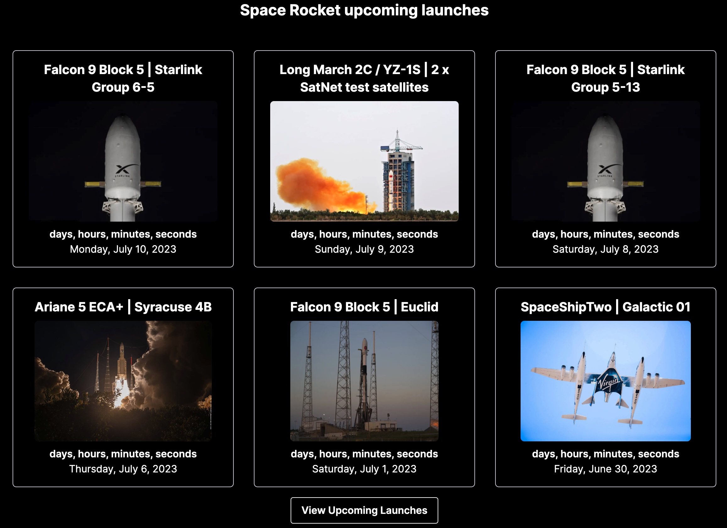
In the example below, the previously created card component is consumed in the app's default page.tsx file:
/* @filename: src/app/page.tsx */ import { client } from './utils/client'; import Link from 'next/link'; /** * this is the previously created Bit components. * it is consumed using its node package, which was generated by bit. */ import { Card } from '@learnbit-react/rocket-roster.ui.card'; export default async function Home() { const allLaunches = await client.getUpcomingLaunches({}); return ( <main> // ... <h2 > Space Rocket upcoming launches </h2> <div> {allLaunches.results.map((launch) => ( <Card key={launch.id} launch={launch} /> ))} </div> </section> <Link href="/past" > View Past Launches </Link> </div> </main> ); }
To learn how to install Bit component in your workspace, See Installing components.
To learn how to import Bit component, to change and update them, see Importing components.
Run the following ro run Bit's dev server/Workspace UI:
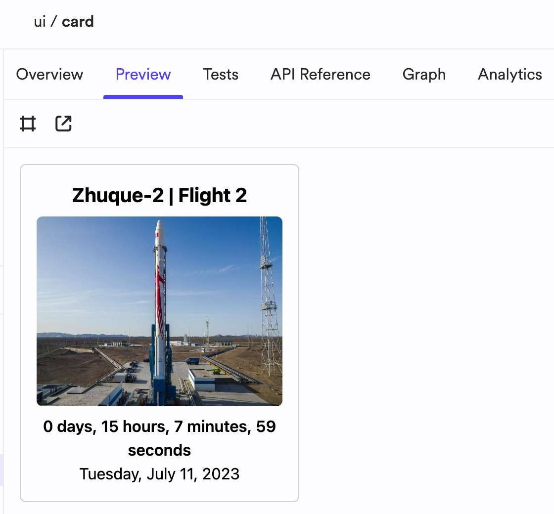
The component previews are loaded from the (component's) *.composition.tsx files.
Make sure to set up your component compositions in a way that allows you to preview them in the Bit UI, without depending on NextJS. This will also make the component usable in other frameworks and projects.
For example, the card component is rendered without NextJS's image optimization, when previewed in the Bit UI:
/* @filename: {COMPONENT_DIRECTORY}/card.tsx */ /** * This component utilizes the image optimization feature, provided by NextJS. */ import Image from 'next/image'; export function Card({ launch, isPreview }: CardProps) { return ( <article key={launch.id}> <header> <h5>{launch.name}</h5> <div> <Image src={launch.image} alt={launch.name} fill // disable NextJS image optimization in component previews unoptimized={isPreview} /> </div> <Countdown date={launch.window_start} /> </header> // ... </article> ); }
When the component is used in its .composition.tsx file, for previewing, the image optimization is turned off:
/* @filename: {COMPONENT_DIRECTORY}/card.composition.tsx */ export const BasicCard = () => { const [launch, setLaunch] = useState<any | null>(null); useEffect(() => { // ... }, []); // disable NextJS image optimization in component previews using the 'isPreview' prop return <>{launch && <Card launch={launch} isPreview />}</>; };
Using NextJS features in component previews
Asx mentioned earlier, an alternative to disabling NextJS features in your component compositions, is to set your component as a NextJS component, using a dedicated NextJS component development environment. This will allow you to use NextJS features in your component compositions, and will also communicate to other developers that the component is meant to be used in a NextJS project.
Note that once your component is snapped and exported, the previews will be available in its component page, in the remote scope.
See the docs here about adding the relevant CI script package.